BeeGridTable,UI更开放的表格!

文章目录
上一篇主要详细介绍了BeeGridTable 的Filter功能,接下来好好盘盘他的Custom Define功能
一、涵盖的自定义功能点有如下
二、举例使用
$\color{MediumTurquoise}{2.1 自定义表格头Template写法}$
1.示例
2.上述例子中表头的$\color{Darkorange}{刷新}$和$\color{Darkorange}{新增}$ 按钮这样摆放,基本上可节省掉业务界面操作区所占用的空间,让界面更简洁、更直观。
$\color{DodgerBlue}{Vue -Template}$
    <BeeGridTable
      border
      height="560"
      :showSummary="false"
      :columns="columns"
      :data="data"
    >
      <template slot-scope="{ column }" slot="hop">
        <Button type="primary" size="small" style="margin-right: 5px"
          >刷新</Button
        >
        <Button type="warning" size="small" @click="addPatient(column)"
          >新增</Button
        >
      </template>

      ...
    </BeeGridTable>
$\color{DodgerBlue}{Vue -Js}$
  data() {
    return {
      columns: [
        ...
        {
          title: "操作",
          slot: "op",
          headSlot: "hop",
          key: "op",
          width: 150,
        },
      ],
      data: [],

      ...
    };
  },
- 上面定义了$\color{Darkorange}{template}$代码片段,其槽名称为$\color{Darkorange}{hop}$,对应column列属性$\color{Darkorange}{headSlot}$的$\color{Darkorange}{hop}$
$\color{MediumTurquoise}{2.2 自定义表格头Render写法}$
1、效果同上,区别主要在$\color{Darkorange}{template}$和$\color{Darkorange}{column}$定义上
$\color{DodgerBlue}{Vue -Template}$
    <BeeGridTable
      border
      height="560"
      :showSummary="false"
      :columns="columns"
      :data="data"
    >
      ...
    </BeeGridTable>
$\color{DodgerBlue}{Vue -Js}$
data() {
    return {
      columns: [
        ...
        {
          title: "操作",
          slot: "op",
          renderHeader: (h, params) => {
            return h("div", [
              h(
                "Button",
                {
                  props: {
                    type: "primary",
                    size: "small",
                  },
                  style: {
                    marginRight: "5px",
                  },
                  on: {
                    click: () => {
                      console.log(params);
                    },
                  },
                },
                "刷新"
              ),
              h(
                "Button",
                {
                  props: {
                    type: "warning",
                    size: "small",
                  },
                  style: {
                    marginRight: "5px",
                  },
                  on: {
                    click: () => {
                      this.addUser();
                    },
                  },
                },
                "新增"
              ),
            ]);
          },
          key: "op",
          width: 150,
        },
      ],
      data: [],
      ...
    };
  },
2、相较之下,render写法真是不得不让人吐槽,一个简单的功能硬是写的像拉面一样长。个人认为在常规业务渲染需求下用$\color{Darkorange}{template}$挺好,如果出现需要用js控制渲染的时候,考虑用$\color{Darkorange}{render}$吧!
$\color{MediumTurquoise}{2.3 自定义列Template写法}$
1、示例
2、上述例子中的性别、分组、观察状态、以及最后一列都是自定义列。从效果上看,有$\color{Darkorange}{Icon}$、$\color{Darkorange}{Select}$、$\color{Darkorange}{Button}$组件。
$\color{DodgerBlue}{Vue -Template}$
 <BeeGridTable
      border
      height="560"
      :showSummary="false"
      :columns="columns"
      :data="data"
    >
      <template slot-scope="{ column }" slot="hop">
        <Button type="primary" size="small" style="margin-right: 5px"
          >刷新</Button
        >
        <Button type="warning" size="small" @click="addPatient(column)"
          >新增</Button
        >
      </template>
      <template slot-scope="{ row, index }" slot="op">
        <Button type="warning" size="small" style="margin-right: 5px"
          >编辑</Button
        >
        <Button type="error" size="small" @click="handleDelete(row, index)"
          >删除</Button
        >
      </template>
      <template slot-scope="{ row }" slot="sex">
        <i
          style="font-size: x-large"
          class="bee-sys-icon md-man"
          v-if="row.sex === 0"
        ></i>
        <i
          style="font-size: x-large; color: red"
          class="bee-sys-icon md-woman"
          v-else
        ></i>
      </template>
      <template slot-scope="{ row }" slot="state">
        <Select v-model="row.state" style="width: 100px">
          <Option
            v-for="item in stateList"
            :value="item.value"
            :key="item.value"
            >{{ item.label }}</Option
          >
        </Select>
      </template>
      <template slot-scope="{ row }" slot="group">
        <Select v-model="row.groupCode" style="width: 100px">
          <Option
            v-for="item in groupList"
            :value="item.code"
            :key="item.name"
            >{{ item.name }}</Option
          >
        </Select>
      </template>
    </BeeGridTable>
$\color{DodgerBlue}{Vue -Js}$
data() {
    return {
      columns: [
        ...
        { title: "性别", slot: "sex", key: "sex", width: 150, resizable: true },
        ...
        {
          title: "分组",
          slot: "group",
          key: "groupName",
          resizable: true,
        },
        {
          title: "观察状态",
          slot: "state",
          key: "state",
          width: 200,
        },
        {
          title: "操作",
          slot: "op",   //自定义列
          headSlot: "hop", //自定义列头
          key: "op",
          width: 150,
        },
      ],
      data: [],

      ...
    };
  },
3、上面定义了$\color{Darkorange}{template}$代码片段,其槽名称为$\color{Darkorange}{sex}$、$\color{Darkorange}{group}$、$\color{Darkorange}{op}$,对应column列属性$\color{Darkorange}{slot}$的$\color{Darkorange}{sex}$、$\color{Darkorange}{group}$、$\color{Darkorange}{op}$。并且BeeGridTable很贴心的给出了当前slot可能会用到的行数据$\color{SkyBlue}{...slot-scope="{ row }"...}$
$\color{MediumTurquoise}{2.4 自定义列Render写法}$
1、效果同上,区别主要在$\color{Darkorange}{template}$和$\color{Darkorange}{column}$定义上
$\color{DodgerBlue}{Vue -Template}$
<BeeGridTable
      border
      height="560"
      :showSummary="false"
      :columns="columns"
      :data="data"
    >
    ...

      <template slot-scope="{ column }" slot="hop">
        <Button type="primary" size="small" style="margin-right: 5px"
          >刷新</Button
        >
        <Button type="warning" size="small" @click="addPatient(column)"
          >新增</Button
        >
      </template>

    ...
    </BeeGridTable>
$\color{DodgerBlue}{Vue -Js}$
 data() {
    return {
      columns: [
        ...
        {
          title: "操作", //headSlot优先
          headSlot: "hop",
          render: (h, params) => {
            return h("div", [
              h(
                "Button",
                {
                  props: {
                    type: "warning",
                    size: "small",
                  },
                  style: {
                    marginRight: "5px",
                  },
                  on: {
                    click: () => {
                      console.log("edit");
                    },
                  },
                },
                "编辑"
              ),
              h(
                "Button",
                {
                  props: {
                    type: "error",
                    size: "small",
                  },
                  style: {
                    marginRight: "5px",
                  },
                  on: {
                    click: () => {
                      console.log("delete");
                    },
                  },
                },
                "删除"
              ),
            ]);
          },
          key: "op",
          width: 150,
        },
      ],
      data: [],

      ...
    };
  },
2、同样,相较之下,render写法真是不得不让人吐槽,一个简单的功能硬是写的像拉面一样长。个人认为在常规业务渲染需求下用$\color{Darkorange}{template}$挺好,如果出现需要用js控制渲染的时候,考虑用$\color{Darkorange}{render}$吧!
$\color{MediumTurquoise}{2.5 自定义筛选Template写法}$
1、例子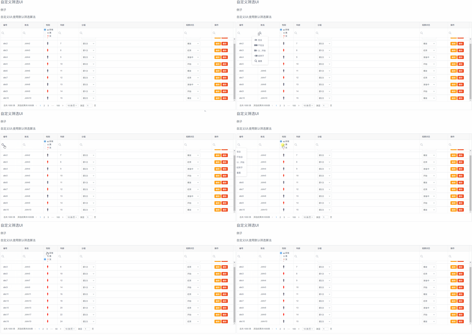
2、示例中可以看到,BeeGridTable本身包含有$\color{Darkorange}{包含}$、$\color{Darkorange}{不包含}$、$\color{Darkorange}{以...开始}$、$\color{Darkorange}{结束于}$、$\color{Darkorange}{重置}$5个基本搜索选项。绝大多数时候,感觉很够用了。但是如果业务上的需求往往很复杂,比如简单点的通过$\color{Darkorange}{CheckBox}$或者$\color{Darkorange}{Radio}$选择过滤、或者通过$\color{Darkorange}{Select}$下拉框进行过滤。这时候,自定义筛选就派上大用场了。正因为考虑到这些问题,$\color{OrangeRed}{BeeGridTable也就没有给出自定义筛选的Render功能}$。
3、实现代码如下,具体关于筛选的分析,可以参考上篇文章
$\color{DodgerBlue}{Vue -Template}$
    <BeeGridTable
      border
      height="560"
      :showSummary="false"
      :columns="columnsCustom"
      :data="data"
    >
      <template slot-scope="{ column }" slot="hop">
        <Button type="primary" size="small" style="margin-right: 5px"
          >刷新</Button
        >
        <Button type="warning" size="small" @click="addPatient(column)"
          >新增</Button
        >
      </template>
      <template slot-scope="{ row, index }" slot="op">
        <Button type="warning" size="small" style="margin-right: 5px"
          >编辑</Button
        >
        <Button type="error" size="small" @click="handleDelete(row, index)"
          >删除</Button
        >
      </template>
      <template slot-scope="{ row }" slot="sex">
        <i
          style="font-size: x-large"
          class="bee-sys-icon md-man"
          v-if="row.sex === 0"
        ></i>
        <i
          style="font-size: x-large; color: red"
          class="bee-sys-icon md-woman"
          v-else
        ></i>
      </template>
      <template slot-scope="{ column, doSortAndFilter }" slot="fsex">
        <RadioGroup
          v-model="column.selectedSexCode"
          @on-change="sexSelected(column, doSortAndFilter)"
        >
          <Radio label="-1">
            <i class="bee-sys-icon md-people"></i>
            <span>所有</span>
          </Radio>
          <Radio label="0">
            <i class="bee-sys-icon md-man"></i>
            <span>男</span>
          </Radio>
          <Radio label="1">
            <i style="color: red" class="bee-sys-icon md-woman"></i>
            <span>女</span>
          </Radio>
        </RadioGroup>
      </template>

      <template slot-scope="{ row }" slot="state">
        <Select v-model="row.state" style="width: 100px">
          <Option
            v-for="item in stateList"
            :value="item.value"
            :key="item.value"
            >{{ item.label }}</Option
          >
        </Select>
      </template>
      <template slot-scope="{ row }" slot="group">
        <Select v-model="row.groupCode" style="width: 100px">
          <Option
            v-for="item in groupList"
            :value="item.code"
            :key="item.name"
            >{{ item.name }}</Option
          >
        </Select>
      </template>

      <template slot-scope="{ column, doSortAndFilter }" slot="hgroup">
        <Select
          transfer
          clearable
          v-model="column.selectedGroup"
          @on-change="filterGroupSelectChange(column, doSortAndFilter)"
          style="width: 100px"
        >
          <Option
            v-for="item in groupList"
            :value="item.code"
            :key="item.name"
            >{{ item.name }}</Option
          >
        </Select>
      </template>
    </BeeGridTable>
$\color{DodgerBlue}{Vue -Js}$
columnsCustom: [
    {
        title: "编号",
        key: "code",
        width: 150,
        resizable: true,
    },
    {
        title: "姓名",
        key: "name",
        width: 150,
    },
    {
        title: "性别",
        slot: "sex",
        key: "sex",
        width: 100,
        selectedSexCode: -1,
        headFilterSlot: "fsex",
    },
    { title: "年龄", key: "age", width: 150, resizable: true },
    {
        title: "分组",
        slot: "group",
        headFilterSlot: "hgroup",
        key: "groupName",
        selectedGroup: null,
        filterMethod(column, field, value, row) {
        if (value === undefined || value === null) {
            return true;
        }

        return value === row.groupCode;
        },
        resizable: true,
    },
    {
        title: "观察状态",
        slot: "state",
        key: "state",
        width: 200,
    },
    {
        title: "操作",
        slot: "op",
        hideFilter: true,
        key: "op",
        width: 150,
    },
    ],


  ...

  methods: {
    sexSelected(column, doSortAndFilter) {
      column.filterValue =
        column.selectedSexCode === "-1" ? null : column.selectedSexCode;
      doSortAndFilter();
    },
    filterGroupSelectChange(column, doSortAndFilter) {
      column.filterValue = column.selectedGroup;
      doSortAndFilter();
    },
  },
三、最后
欢迎大家留言讨论或者进群讨论,共同学习进步!如果你喜欢本文章请关注下方公众号二维码,会更新更多相关话题哦!
评论
登录后参与技术讨论,分享你的经验与见解。
登录 / 注册暂无评论