Material design - 尺寸参考 部分(笔记)

文章目录
Overview

App bar height: 56dp
App bar left and right padding: 16dp
App bar icon top, bottom, left padding: 16dp
App bar title left padding: 72dp
App bar title bottom padding: 20dp
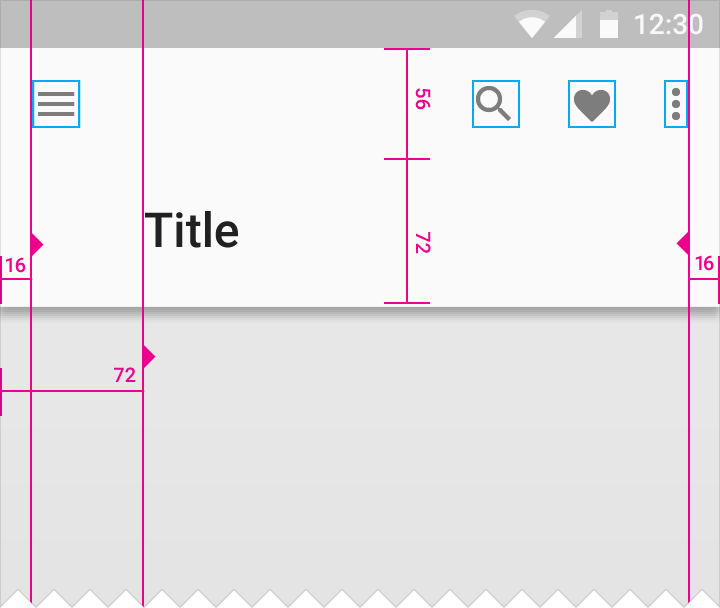
The app bar with significantly increased height for prominence
App bar height = 128dp

Action area height: 56dp
Title area height: 80dp
Title area bottom padding: 8dp
Description area height: 72dp
Description area bottom padding: 16dp
List
A two-column, left-aligned list with a 56dp floating action button.
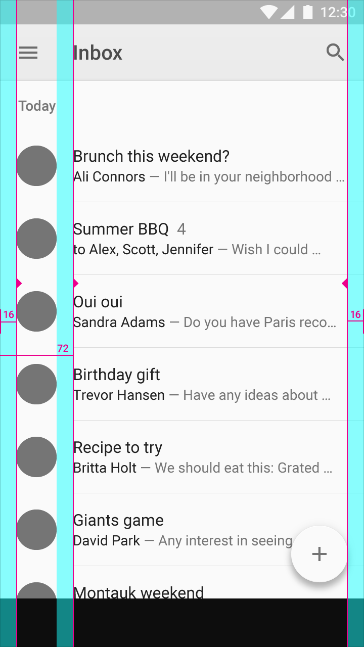
Keylines and margins
Screen edge left and right margins: 16dp
Content associated with an icon or avatar left margin: 72dp
Horizontal margins on mobile: 16dp.
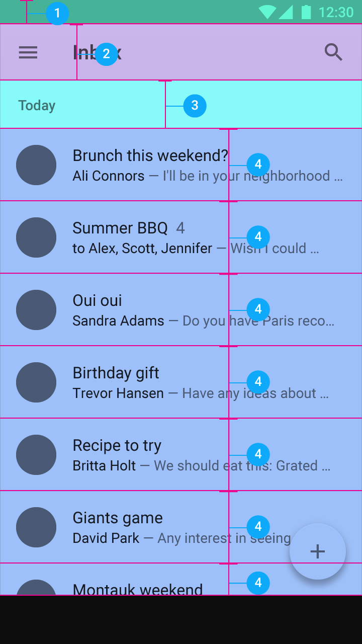
Vertical spacing
Status bar: 24dp
Toolbar: 56dp
Subtitle: 48dp
List item: 72dp
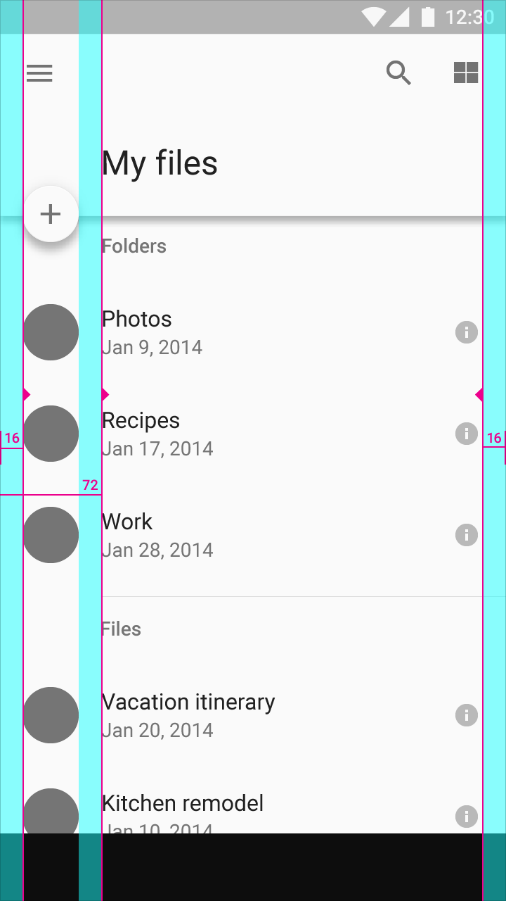
Keylines and margins
Screen edge left and right margins: 16dp
Content left margin from screen edge: 72dp

Vertical spacing
Status bar: 24dp
Toolbar: 56dp
Title and list items: 72dp
Subtitle: 48dp
Space between content areas: 8dp
Detail view
A detail card with a 56dp floating action button.
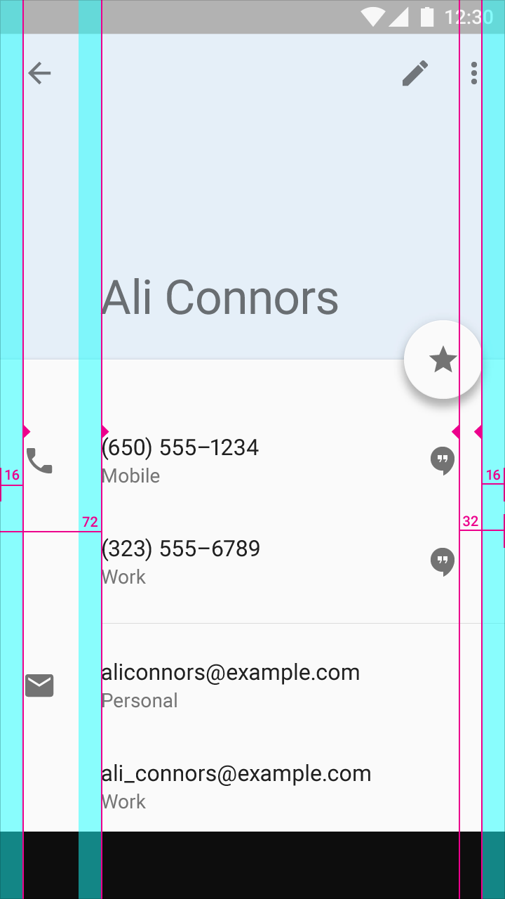
Keylines and margins
Screen edge left and right margins: 16dp
Content left margin from screen edge: 72dp
Right-side icons align 32dp from the right edge to coordinate with the floating action button.
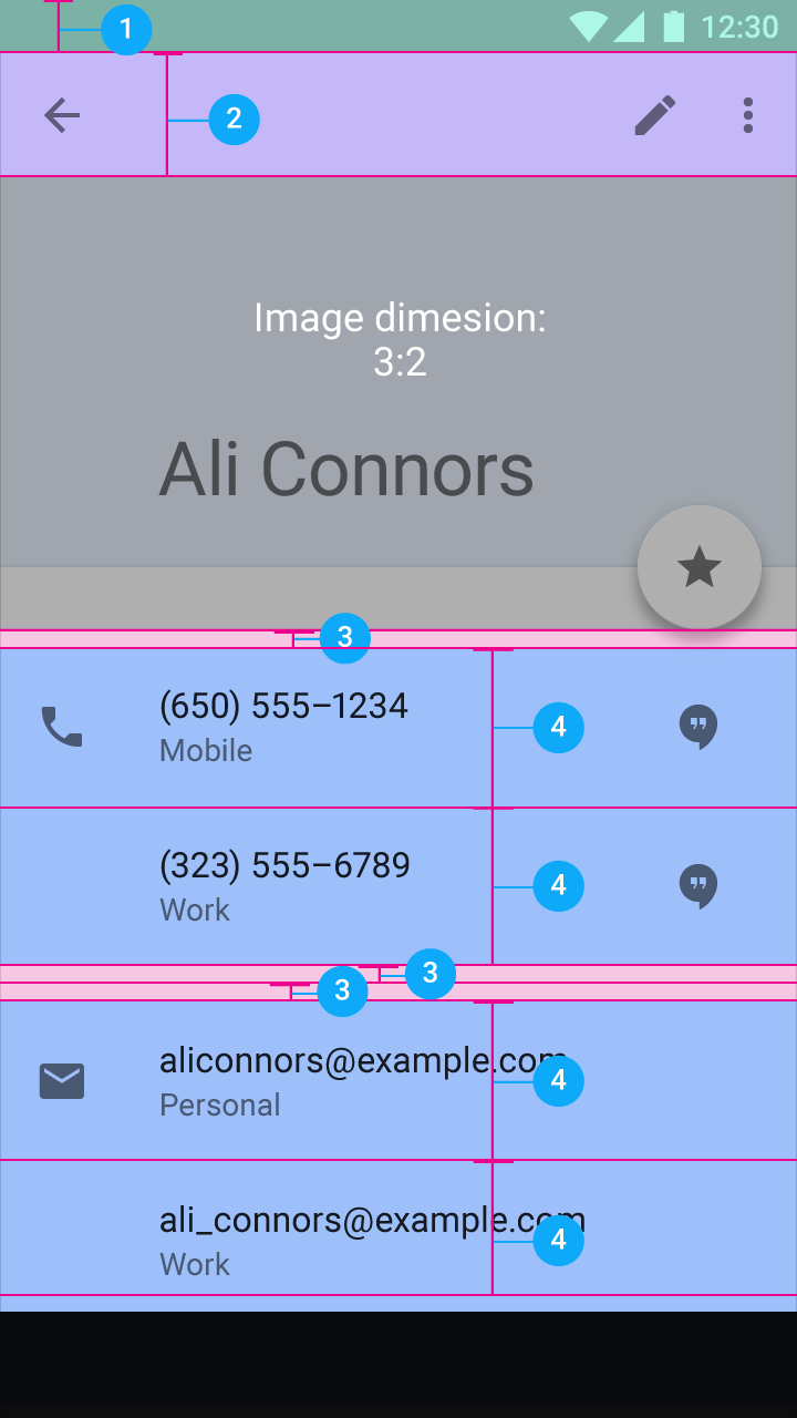
Vertical spacing
Status bar: 24dp
Toolbar: 56dp
Space between content areas: 8dp
List item: 72dp
Navigation drawer
A side navigation menu with icons, avatars, and text aligned on the left. Other icons align on the right.

Keylines and margins
Screen edge left and right margins: 16dp
Content associated with an icon or avatar left margin: 72dp
Side nav width: The screen width minus the height of the action bar. Here, the width is 56dp from the right screen edge.
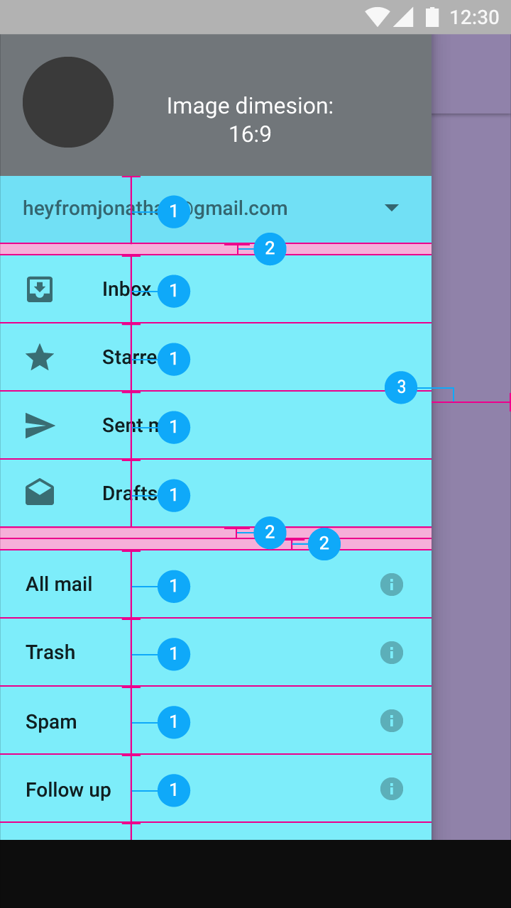
Vertical spacing
Account menu and list items: 48dp
Space between content areas: 8dp
Navigation right margin: 56dp
评论
登录后参与技术讨论,分享你的经验与见解。
登录 / 注册暂无评论