拓端数据(tecdat):python对网络图networkx进行社区检测和彩色绘图

文章目录
原文链接:http://tecdat.cn/?p=7598
以下是创建图表,检测其中的社区,然后在少于10行的python中使用由其社区着色的节点进行可视化的方法:
import networkx as nx
import community

G = nx.random_graphs.powerlaw_cluster_graph(300, 1, .4)

part = community.best_partition(G)
values = [part.get(node) for node in G.nodes()]

nx.draw_spring(G, cmap = plt.get_cmap('jet'), node_color = values, node_size=30, with_labels=False)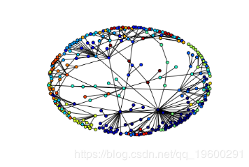
[](https://en.wikipedia.org/wiki...
 mod = community.modularity(part,G)
print("modularity:", mod)给了modularity: 0.8700238252368541。

最受欢迎的见解
3.Python数据可视化-seaborn Iris鸢尾花数据
7.R语言动态可视化:制作历史全球平均温度的累积动态折线图动画gif视频图
评论
登录后参与技术讨论,分享你的经验与见解。
登录 / 注册暂无评论