CSS_进阶

文章目录
CSS_进阶
1. 动画
1) 实现步骤
1. 定义动画帧
      @keyframes 动画名{
        from {
          // 开始帧
        }
        to {
          // 结束帧
        }
      }

      @keyframes 动画名{
        0% {
          // 开始帧
        }
        20% {

        }
        ...
        100% {
          // 结束帧
        }
      }
2. 设定动画(贺卡)
      animation-name: move;
        动画名
      animation-duration: 2s;
        持续时间
      animation-timing-function: linear;
        时间曲线函数(自由落体,贝塞尔曲线)
      animation-fill-mode:forwards;
        填充模式,动画结束后保留哪一帧规则
      animation-iteration-count: 2;
        动画迭代次数 infinite
      animation-direction: alternate-reverse;
        动画执行的方向 from->to , to->from
      animation-play-state: paused;
        动画状态
      animation-delay: 1s;
        延迟时间
      animation: move 2s 1s 2 linear;
        动画的速写形式
2) 案例(呼吸灯)
<!DOCTYPE html>
<html lang="en">
<head>
    <meta charset="UTF-8">
    <title>hi</title>
    <style>
        *{
            -webkit-box-sizing: border-box;
            -moz-box-sizing: border-box;
            box-sizing: border-box;
        }
        .container{
            width:226px;
            height: 330px;
            background: #343434;
            margin:0 auto ;
        }
        .circles{
            padding: 36px;/*动画*/
            height: 226px;

            animation-name:wobble;
            animation-duration: 4.4s;   /*9s*/
            animation-timing-function: linear;
            animation-delay: 0s;
            animation-iteration-count: infinite;

        }
        .circles > .outer{
            height: 100%;
            border:5px solid #9b9b9b;
            padding: 10px;/*动画*/

            border-radius:50%;
            border-radius:50%;


            animation-name:outer_wobble;
            animation-duration: 4.4s;  /*9s*/
            animation-timing-function: linear;
            animation-delay: 0s;
            animation-iteration-count: infinite;
        }
        .circles > .outer > .inner{
            height: 100%;
            border:15px solid #ffffff;

            border-radius:50%;
            border-radius:50%;
        }

        @keyframes outer_wobble {
            20% {
                padding: 20px;
            }
            40% {
                padding:10px;
            }
            65%{
                padding:22px;
            }
            100%{
                padding: 10px;
            }
        }

        @keyframes wobble {
            20% {
               padding: 26px;
            }
            40% {
                padding:36px;
            }
            100%{
                padding:36px;
            }
        }

        .text{
            font-size: 22px;
            color: #ffffff;
            text-align: center;
        }
    </style>
</head>
<body>
    <div class="container">
        <div class="circles">
            <!--外部圆-->
            <div class="outer">
                <!--内部-->
                <div class="inner">

                </div>
            </div>
        </div>
        <div class="text">
            HI!
        </div>

    </div>
</body>
</html>
3) 案例(梦幻西游)
<!DOCTYPE html>
<html lang="en">
<head>
    <meta charset="UTF-8">
    <title>梦幻西游</title>
    <link rel="stylesheet" href="../common.css">
    <style>
        html {
            color: #333;
            font:normal 12px '微软雅黑','Microsoft YaHei';
        }
        body,ul,ol,p,h1,h2,h3 {
            margin: 0;
            padding: 0;
        }
        ul,ol {
            list-style: none;
        }
        a {
            text-decoration: none;
            color: #333;
        }

        .content {
            width: 950px;
            position: absolute;
            left: 50%;
            margin-left: -475px;
            bottom: 300px;
        }
        .content > ul::after {
            display: block;
            content: "";
            clear: both;
        }
        .content > ul > li {
            float: left;
            width: 200px;
            height: 180px;
            margin-right: 50px;
            overflow: hidden;
        }
        .content > ul > li:last-child {
            margin-right: 0;
        }
        .content > ul > li > div {
            width: 1600px;
            height: 180px;

            animation-name: dong;
            animation-duration: 1s;
            animation-timing-function: steps(8);
            animation-iteration-count: infinite;
            /*animation-direction: reverse;*/
        }
        .content > ul > li > div  img {
            width: 100%;
        }

        /*定义动画*/
        @keyframes dong {
            from {
                margin-left: 0;
            }
            to {
                margin-left: -1600px;
            }
        }

        html,body,.main {
            height: 100%;
        }
        .main {
            width: 100%;
            overflow-x: hidden;
        }
        .main > .bg {
            width: 3920px;
            height: 100%;
            margin-left: -1920px;
            background-image: url('./images/bg.jpg');
            background-repeat: repeat-x;

            animation-name: bg;
            animation-duration: 30s;
            animation-timing-function: linear;
            animation-iteration-count: infinite;
        }

        @keyframes bg {
            from {
                margin-left: -1920px
            }
            to {
                margin-left: 0;
            }
        }
    </style>
</head>
<body>
    <div class="main">
        <div class="bg"></div>
    </div>
    <!-- 屏幕中间 宽 200 * 4 + 50*3 = 950 -->
    <div class="content">
        <ul>
            <li>
                <div><img src="./images/wk.png" alt=""></div>
            </li>
            <li>
                <div><img src="./images/bj.png" alt=""></div>
            </li>
            <li>
                <div><img src="./images/ts.png" alt=""></div>
            </li>
            <li>
                <div><img src="./images/ss.png" alt=""></div>
            </li>
        </ul>
    </div>
</body>
</html>
2. 动画库 animate.css
动画帧、动画设定规则都有第三方完成,我们直接使用class即可
1) 引入动画库
<link rel="stylesheet" href="https://cdn.bootcdn.net/ajax/libs/animate.css/4.1.1/animate.css">2) 使用
1. 直接调用动画设定类
<div class="box animate__animated animate__infinite animate__bounce"></div>2. 引用关键帧
      <style>
        .bounce {
          animation: flash 10s linear infinite;
        }
      </style>
      <div class="box bounce"></div>
3. 过渡
过渡是轻量级的动画,过渡中无需定义关键帧,它解决的问题是当属性改变的时候实行缓缓改变。一般通过伪类来触发。过渡一定发生在属性值改变上(状态发生变化的时候)
  transition-property: width;
    过渡属性,取值可以为多个,多个值通过逗号分割;关键字:all 所有属性
  transition-duration: 2s;
    过渡持续时间
  transition-delay: 0;
    过渡延迟时间
  transition-timing-function: linear;
    时间曲线函数
  transition:transform,background-color 2s,2s 0s linear;
    速写形式
4. 变形
transform:变形函数
  1. 缩放
    scale(2)
  2. 平移
    translate(100px,50px)
  3. 旋转
    rotate(360deg)
  4. 拉伸
    skew(45deg)
5. 媒体查询(响应式布局)
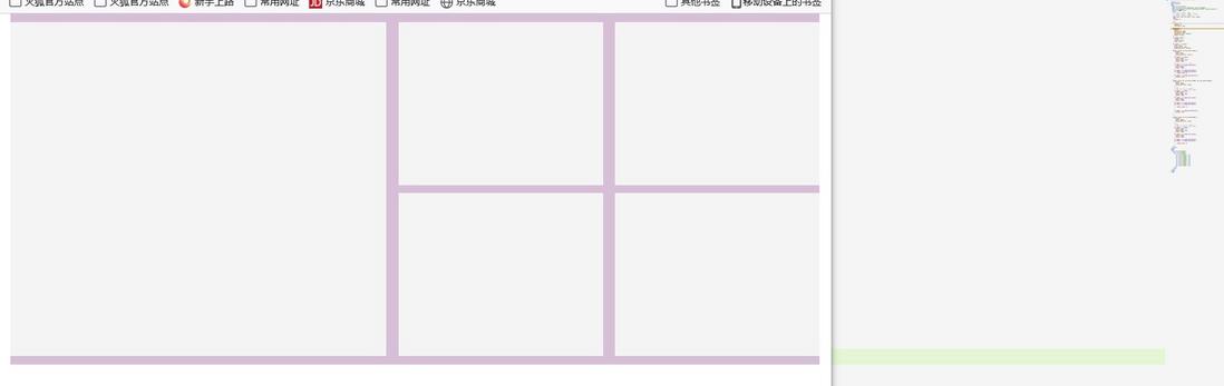
CSS的媒体查询模块允许在不改变代码的前提下对显示效果进⾏调整,媒体查询由两部分组
成,⼀个可选的媒体类型,以及若⼲个css表达式。当媒体类型判断结果为true的时候,其中的
css表达式被解析。如果媒体查询应⽤在link中,即使判断结果为false,样式表同样会被下载,
但是不会应⽤。⽤媒体查询来实现响应式布局。
<!DOCTYPE html>
<html lang="en">
<head>
  <meta charset="UTF-8">
  <meta http-equiv="X-UA-Compatible" content="IE=edge">
  <meta name="viewport" content="width=device-width, initial-scale=1.0">
  <title>腾讯视频</title>
  <style>
    /*  screen < 1280px   990px   */
    /*  1280px < screen < 1400px   1200px*/
    /*  screen > 1400px   1400px*/
    html {font: 12px '微软雅黑'; color: #666;}
    body {
      margin: 0;
    }
    ul {
      margin: 0;
      padding: 0;
      list-style: none;
    }
    .container {}
    .content {
      padding-top: 10px;
      min-height: 100px;
      background-color: #f4f4f4;
      margin: 0 auto;
    }
    ul.videos::after {
      content: "";
      display: block;
      clear: both;
    }
    ul.videos > li.video {
      float: left;
      margin-bottom: 10px;
      background-color: #f4f4f4;
    }
    @media screen and (max-width:1279px) {
      .content {
        width: 990px;
        background-color: thistle;
      }
      ul.videos > li.video {
        width: 250px;
        margin-right: 15px;
        height: 200px;
      }
      /* 10px * 3 + 2x + y = 990 */
      ul.videos > li.video:first-child {
        width: 460px;
        height: 410px;
      }
      ul.videos > li.video:nth-child(3),
      ul.videos > li.video:nth-child(5){
          margin-right: 0;
      }
      ul.videos > li.video:nth-child(n+6) {
        display: none;
      }
    }
    @media screen and (min-width:1280px) and (max-width:1400px) {
      .content {
        width: 1200px;
        background-color: tomato;
      }
      /*7 */
      /* 10px * 3 + 3x + y = 1200 */
      /* 10px * 3 + 3*200 + 570 = 1200 */
      ul.videos > li.video {
        width: 200px;
        margin-right: 10px;
        height: 180px;
      }
      ul.videos > li.video:first-child {
        width: 570px;
        height: 370px;
      }
      ul.videos > li.video:nth-child(4),
      ul.videos > li.video:nth-child(7)
      {
          margin-right: 0;
      }

      ul.videos > li.video:nth-child(n+8) {
        display: none;
      }
    }

    @media screen and (min-width:1400px) {
      .content {
        width: 1400px;
        background-color: violet;
      }
      /*9 */
      /* 10px * 4 + 4x + y = 1400 */
      /* 10px * 4 + 4*220 + 480 = 1400 */
      ul.videos > li.video {
        width: 220px;
        margin-right: 10px;
        height: 200px;
      }
      ul.videos > li.video:first-child {
        width: 480px;
        height: 410px;
      }
      ul.videos > li.video:nth-child(5),
      ul.videos > li.video:nth-child(9)
      {
          margin-right: 0;
      }
    }
  </style>
</head>
<body>
  <div class="container">
    <div class="content">
      <ul class="videos">
        <li class="video"></li>
        <li class="video"></li>
        <li class="video"></li>
        <li class="video"></li>
        <li class="video"></li>
        <li class="video"></li>
        <li class="video"></li>
        <li class="video"></li>
        <li class="video"></li>
      </ul>
    </div>
  </div>
</body>
</html>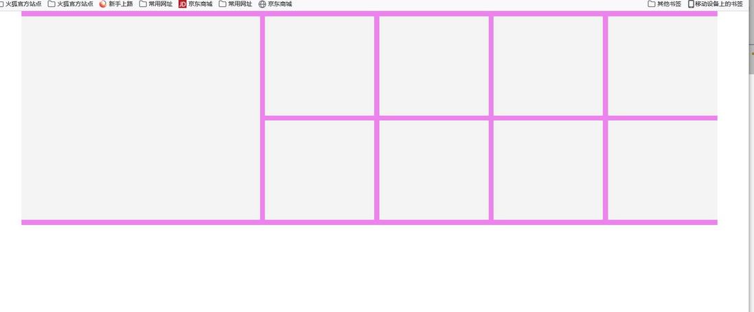

在bootstrap中响应式如下代码:
      <div class="row">
        <div class="col-sm-3"></div>
        <div class="col-sm-3"></div>
        <div class="col-sm-3"></div>
        <div class="col-sm-3"></div>
      </div>
      <div class="row">
        <div class="col-md-4"></div>
        <div class="col-md-4"></div>
        <div class="col-md-4"></div>
      </div>
      <div class="row">
        <div class="col-lg-6"></div>
        <div class="col-lg-6"></div>
      </div>
补充知识点
verticle-align 行内元素在垂直方向上的排列规则。这个规则只能应用于行内元素
1.前提
盒子中存在多个行内元素
2.基线
3.代码示例
verti-align: bottom;/*图片底部与容器底部对齐*/
verti-align: middle;/*图片与文字居中对齐*/
verti-align: text-top;/*图片与文字顶端对齐*/
verti-align: text-bottom;/*图片与容文字底部对齐*/
verti-align: 50%;/*图片相对于基线上移*/
1. 动画题目:
1. 效果要求
(1. 定义:目前两圈的大小为常规大小
(2. 正常运动轨迹:两圈常规大小 -> 外圈向外扩大10px(2000ms) -> 外圈向内回归正常大小(2000ms)-> 内圈向内缩小12px(2500ms) -> 内圈放大至常规大小(2500ms) -> 循环
(3. 加速运动轨迹:两圈常规大小 -> 外圈向外扩大10px(1000ms) -> 外圈向内回归正常大小(1000ms)-> 内圈向内缩小12px(1200ms) -> 内圈放大至常规大小(1200ms) -> 循环
(4. 加速运动轨迹下,当文字显示为:“我很生气”时,内圈的颜色变为红色
(5. 加速运动轨迹下,当文字显示为:“我很高兴”时,内圈的颜色变为绿色
2. 第三方库(职业技能)
(1.iconfont
字体图标库,原理:网络字体 @font-face() font-family
(2.bootstrap
栅格布局(grid layout,原理:flex、float
(3.animate.css
动画库,原理:animation
评论
登录后参与技术讨论,分享你的经验与见解。
登录 / 注册暂无评论