炫酷的闪光按钮

文章目录
哈哈哈,从b站学习的css效果,在这里重新敲一下。哈哈哈~~
 body {
            margin: 0;
            padding: 0;
            background: #000;
        }

        a {
            position: absolute;
            top: 50%;
            left: 50%;
            transform: translate(-50%, -50%);
            width: 200px;
            height: 60px;
            text-align: center;
            line-height: 60px;
            color: #fff;
            font-size: 24px;
            text-transform: uppercase;
            text-decoration: none;
            font-family: sans-serif;
            box-sizing: border-box;
            background: linear-gradient(90deg, #03a9f4, #f441a5, #ffeb3b, #03a9f4);
            background-size: 400%;
            border-radius: 30px;
            z-index: 1;
        }

        a:hover {
            animation: ani 8s linear infinite;
        }

        @keyframes ani {
            0% {
                background-position: 0%;
            }
            100% {
                background-position: 400%;
            }
        }

        a::before {
            content: "";
            position: absolute;
            top: -5px;
            left: -5px;
            right: -5px;
            bottom: -5px;
            z-index: -1;
            background: linear-gradient(90deg, #03a9f4, #f441a5, #ffeb3b, #03a9f4);
            background-size: 400%;
            border-radius: 40px;
            filter: blur(20px);
            opacity: 0;
            transition: 0.5s;
        }

        a:hover::before {
            filter: blur(20px);
            opacity: 1;
            animation: ani 8s linear infinite;
        }
效果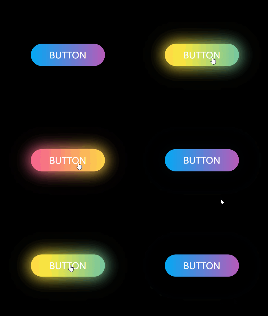
其中涉及到的不太常用的css属性
- filter: w3c中filter(滤镜) 属性
- 线性渐变:w3c中的线性渐变
- animation:w3c中关于animation的定义
评论
登录后参与技术讨论,分享你的经验与见解。
登录 / 注册暂无评论