[Vue笔记] 简单写一个`dropdown`组件

文章目录
项目介绍
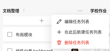
闲得没事,顺便把Teambition的dropdown用自己的技术实现一下,顺带把笔记也做好
设计需求
结构组成
- 一个三点的图标作为激活
dropdown的菜单栏打开的入口entry dropdown的菜单栏menumenu中由更小的menu-item组件构成,这是我自己的想法,为了能够复用
- 一个三点的图标作为激活
布局要求
menu需要以entry为参照,定位在下方一定位置menu在dropdown未被激活时,不能显示menu出现时不能影响其他组件的布局
向上传递事件
- 通过点击
menu-item来触发事件,并向上传递
- 通过点击
menu-item组件menu-item需要svg图标,文字text和触发事件名称action- 由于
svg文字太长,将其设置为slot插入,其余设置为props
[Dropdown] 基本结构
<template>
  <div class="dropdown" :class="{'active': active}">
    <div class="entry" @click="toggleHandler">
    ...
    </div>

    <div class="menu">
      <menu-item text="edit" action="edit" @click="handler">
        <svg class="icon" viewBox="0 0 1024 1024">
        ...
        </svg>
      </menu-item>

      <menu-item text="add" action="add" @click="handler">
        <svg class="icon" viewBox="0 0 1024 1024">
        ...
        </svg>
      </menu-item>

      <menu-item text="delete" action="delete" @click="handler">
        <svg class="icon" viewBox="0 0 1024 1024">
        ...
        </svg>
      </menu-item>

    </div>

  </div>
</template>
代码说明
menu-item中的@click绑定请移步下面,有你要找的$emit
[Dropdown] 样式 <style scoped>
整体布局
div.dropdown {
  display: flex;
  flex-direction: column;
  align-items: center;
}

.menu {
  position: absolute;
  top: 31.5px;
}
设置下entry的图标
.entry svg.icon {
  width: 1em;
  height: 1em;
  opacity: 0.5;
}

.entry svg.icon:hover {
  opacity: 1;
  cursor: pointer;
}将entry作为menu定位的参照
.entry svg.icon {
  position: relative;
}
[Dropdown] 行为 <script>
<script>
import menuItem from '@/components/menu-item'
export default {
  components: {
    'menu-item': menuItem,
  },

  props: {
    active: {
      type: Boolean,
      default: false,
    },
  },

  methods: {
    toggleHandler() {
      this.$emit('toggled')
    },

    handler(action) {
      this.$emit('toggle-menu', action)
    }
  },
}
</script>
代码说明
active代表dropdown是否被激活v-show="active"控制menu的显示
[menu-item] 基本结构
<template>
  <div class="menu-item" @click="handler">
    <span class="icon">
      <slot> </slot>
    </span>
    <span class="text"> {{ text }}</span>
  </div>
</template>
[menu-item] 样式
整体布局
.menu-item {
  display: flex;
  cursor: pointer;
}

span.icon {
  width: 20px;
  height: 20px;
  margin-right: 8px;

  display: flex;
  align-items: center;
  justify-content: center;
}
设置图标大小
span.icon svg {
  width: 100%;
  height: 100%;
}
代码说明
这里建议为.menu-item设置长度,这里我懒得弄
[menu-item] 行为 <script>
<script>
export default {
  props: {
    text: {
      type: String,
      default: '',
    },

    action: {
      type: String,
      default: 'hello',
    },
  },

  methods: {
    handler() {
      this.$emit('click', this.action)
    },
  },
}
</script>
代码说明
handler将会把自定义触发事件的名称作为参数向上传递,对父组件来说事件依然时click,只不过需要额外处理一个参数
补全图标
在上面的dropdown基本结构中,由于文字太多,我把一些图标的代码省略掉了,下面我一一补全
<svg t="1608216593558" class="icon" viewBox="0 0 1024 1024" version="1.1" xmlns="http://www.w3.org/2000/svg" p-id="3281" width="48" height="48"><path d="M110.336 572.330667a85.333333 85.333333 0 1 0 120.661333-120.661334 85.333333 85.333333 0 0 0-120.661333 120.661334zM451.669333 572.330667a85.333333 85.333333 0 1 0 120.661334-120.661334 85.333333 85.333333 0 0 0-120.661334 120.661334zM793.002667 572.330667a85.333333 85.333333 0 1 0 120.661333-120.661334 85.333333 85.333333 0 0 0-120.661333 120.661334z" p-id="3282"></path></svg>

<svg class="icon" viewBox="0 0 1024 1024">
    <path d="M856.576 290.304l-63.488 63.488-122.88-122.88 63.488-63.488a11.776 11.776 0 0 1 8.704-3.584 11.264 11.264 0 0 1 8.704 3.584l105.472 105.472a12.8 12.8 0 0 1 0 17.408zM208.896 716.8L307.2 815.616l-131.584 32.768 33.28-131.584z m153.6 65.536l-122.88-120.832 387.072-387.072 122.88 122.368-388.096 386.56z m537.6-552.96l-105.472-105.472a74.24 74.24 0 0 0-102.4 0L174.592 640a68.608 68.608 0 0 0-18.432 32.256L102.4 883.2a31.744 31.744 0 0 0 8.192 29.696 30.208 30.208 0 0 0 22.528 8.704h7.68l210.944-51.2a66.048 66.048 0 0 0 32.256-18.432L900.096 333.824a74.24 74.24 0 0 0 0-102.4z"></path>
</svg>

<svg class="icon" viewBox="0 0 1024 1024">
    <path d="M476.16 476.16V191.0272c0-20.6848 16.0256-37.4272 35.84-37.4272 19.8144 0 35.84 16.7424 35.84 37.4272V476.16h285.1328c20.6848 0 37.4272 16.0256 37.4272 35.84 0 19.8144-16.7424 35.84-37.4272 35.84H547.84v285.1328c0 20.6848-16.0256 37.4272-35.84 37.4272-19.8144 0-35.84-16.7424-35.84-37.4272V547.84H191.0272C170.3424 547.84 153.6 531.8144 153.6 512c0-19.8144 16.7424-35.84 37.4272-35.84H476.16z"></path>
  </svg>

<svg class="icon" viewBox="0 0 1024 1024">
    <path d="M890.88 241.9712h-230.2976V202.752c0-55.296-45.056-100.352-100.352-100.352H463.7696c-55.3472 0-100.352 45.056-100.352 100.352v39.2192H133.12a30.72 30.72 0 0 0 0 61.4912h66.3552L296.2432 855.04c2.56 14.6944 15.3088 25.3952 30.2592 25.3952h370.9952a30.72 30.72 0 0 0 30.2592-25.3952l96.768-551.5776H890.88a30.72 30.72 0 0 0 0-61.4912M261.8368 303.4624h103.68l37.2224 515.584h-50.432L261.8368 303.4624m202.496 515.584l-37.1712-515.584h169.6768l-37.1712 515.584H464.3328m207.36 0h-50.432l37.1712-515.584h103.7312l-90.4704 515.584M463.7696 163.8912h96.4608c21.4528 0 38.912 17.408 38.912 38.8608v39.2192H424.8576V202.752a38.912 38.912 0 0 1 38.912-38.8608"></path>
</svg>在父组件Home.vue中
<template>
  <div class="home">
    <dropdown
      :active="active"
      @toggled="toggleDropDown"
      @toggle-menu="toggleMenu"> </dropdown>
  </div>
</template>

<script>
// @ is an alias to /src
import dropdown from '@/components/dropdown'
export default {
  name: 'Home',
  components: {
    dropdown,
  },

  data() {
    return {
      active: false,
    }
  },

  methods: {
    toggleMenu(action) {
      console.log(action)
    },

    toggleDropDown() {
      this.active = !this.active
    },
  },
}
</script>
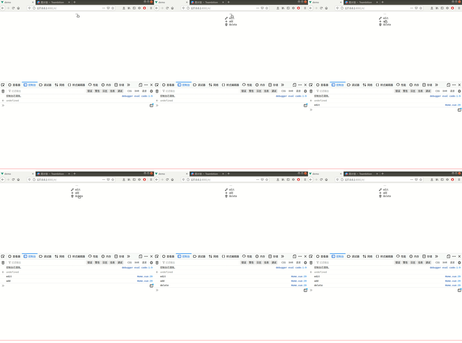
DEMO
评论
登录后参与技术讨论,分享你的经验与见解。
登录 / 注册暂无评论