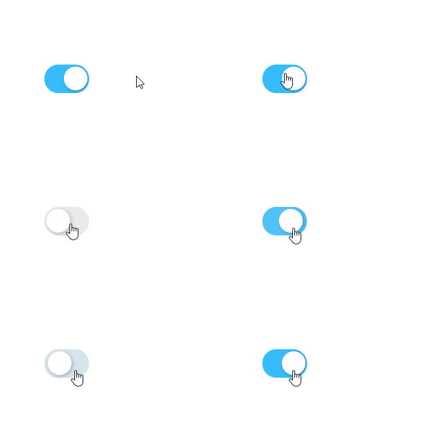
一个DIV实现一个好看的Switch开关

文章目录
关键代码
<div @click="open=!open" :class="['switch',open?'switch-checked':'']"></div>.switch,
.switch::before,
.switch::after {
box-sizing: border-box;
margin: 0;
padding: 0;
}
.switch {
cursor: pointer;
border-width: 2px;
border-style: solid;
border-radius: 2rem;
box-shadow: 0 0 .1rem rgba(0, 0, 0, 0.05);
position: relative;
transition: all .3s ease;
display: inline-block;
width: 3.2rem;
height: calc(1.7rem + 5px);
background-color: #E9E9E9;
border-color: #E9E9E9;
}
.switch.switch-checked {
border-color: rgb(54, 188, 250);
background-color: rgb(54, 188, 250);
}
.switch:after {
content: '';
top: 0;
left: 0;
border-radius: 2rem;
position: absolute;
width: 1.7rem;
height: 1.7rem;
background-color: #ffffff;
box-shadow: .1rem .1rem .3rem rgba(0, 0, 0, 0.25);
transform: translateX(0) scale(1, 1);
transition: all .3s ease;
}
.switch.switch-checked:after {
transform: translateX(1.4rem);
margin-left: -2px;
}
.switch:active:after {
width: 2.04rem;
}
.switch.switch-checked:active:after {
width: 2.04rem;
margin-left: -.45rem;
}
代码说明
开关动画效果是通过增加和删除 “switch-checked”类实现的
评论
登录后参与技术讨论,分享你的经验与见解。
登录 / 注册暂无评论