flex布局,子元素宽度不符合预期

文章目录
预期
子元素内容不同,但是希望子元素平均分成三份: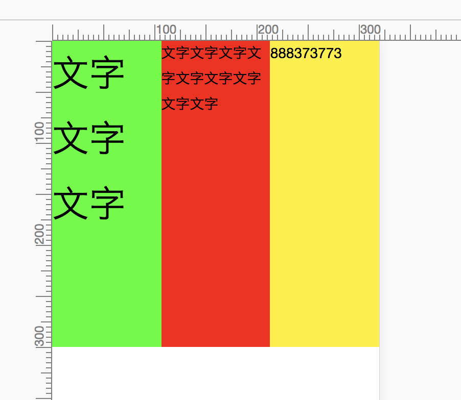
遇到的问题
实际上每个子元素会根据内容宽度的不同而不平均分配:
代码:
<div class="box">
    <div class="child child1">
      <h1>文字文字文字</h1>
    </div>
    <div class="child child2">
      <p>文字文字文字文字文字文字文字文字文字</p>
    </div>
    <div class="child child3">
      <p>888373773</p>
    </div>
</div>
.box{
display: flex;
}
.child{
height: 300px;
}
.child1{
flex-grow: 1;
background-color: #0f0;
}
.child2{
flex-grow: 1;
background-color: #f00;
}
.child3{
flex-grow: 1;
background-color: #fff000;
}解决方案
给每个子元素的宽度设置为0:
      .child{
        height: 300px;
        width: 0;
      }
就解决这个问题啦!!!!!
并且这个解决方案也适合在flex布局中,overflow失效的情况!
原理
不太清楚,待更新.....
评论
登录后参与技术讨论,分享你的经验与见解。
登录 / 注册暂无评论