html前端三列布局

文章目录
三列布局
初衷
这得从去年我12月毕业去面试说起,学了三年前端,终于可以出山了。怀着无比激动投了上百份简历,命中率60%。虽说战果还是可以的,但是在近百场面试中,确实让我收获颇多,此文写于对前端的面试中发现自己的不足,查漏补缺,更加让自己的技术更加成熟,发现自己不足,从中明白自己的缺失。同时也希望也能帮助各位江湖中人解惑。序言
这里所要介绍的布局知识主要是在解决三列布局模式而出现的几种布局解法,其中包含了经典的圣杯布局,双飞翼布局,绝对定位的布局方式,还包含2009年W3C所提出的Flex布局方式和以CSS3所带来的calc计算函数来解决三列布局的方式三列布局解决方法
圣杯布局
由来:2006 年 Matthew Levine 在 《A LIST APART》 > 上发表了一篇名为 《In Search of the Holy Grail》的文章,提出了 圣杯布局 的思路。利用 负外边距 来实现我们需要的效果,充分体现了 CSS的艺术 与 负外边距 的强大。原理: 利用float浮动和定位、负边框,实现两边固定,中间自适应的三栏布局
具体实现(采用html5和css3的语义化实现)
<body>
    <!-- header start -->
    <header>header</header>
    <!-- header end -->
    <!-- main start -->
    <main>
        <div class="main">main</div>
    <div class="left">left</div>
    <div class="right">right</div>
    </main>
    <!-- main end -->
    <!-- footer start -->
    <footer>footer</footer>
    <!-- footer end -->
</body>
/* header */
header{
height: 200px;
width: 100%;
background: #5dbb79;
display: flex;
justify-content: center;
align-items: center;
}
/* main */
main{
padding: 0 200px;
}
main .main{
float: left;
width: 100%;
height:400px;
background: rgb(73, 182, 176);
display: flex;
justify-content: center;
align-items: center;
}
main .left{
float: left;
width: 200px;
height: 400px;
margin-left: -100%;
position: relative;
left: -200px;
background: rgb(131, 124, 104);
display: flex;
justify-content: center;
align-items: center;
}
main .right{
float: left;
width: 200px;
height: 400px;
margin-left: -200px;
position: relative;
left: 200px;
background: rgb(131, 124, 104);
display: flex;
justify-content: center;
align-items: center;
}
/* footer */
footer {
height: 100px;
width: 100%;
clear: both;/*clear属性清除content内的浮动元素透出来 */
background: rgb(210, 209, 208);
display: flex;
justify-content: center;
align-items: center;
}效果图如下

缺陷图如下
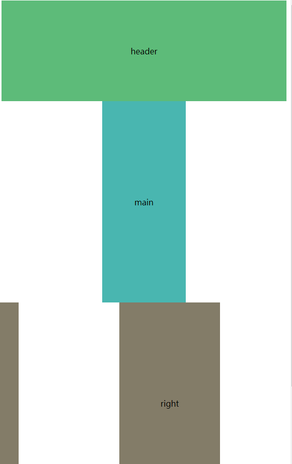
该布局存优缺点
优点:可以左右拉伸,内容区域为自动缩放,符合早期的传统三列布局
缺点:当缩放当一定程度,会发现整个页面结构将会紊乱。这个问题用现在可以用到css3的mi-width可以解决。
圣杯双飞翼布局
由来:双飞翼布局是圣杯布局演化而来的,且是旨在要解决圣> 杯布局所遇到的问题,即缩小到一定程度后页面布局依旧正> > 常,因为代码和圣杯基本一致,只是结构略有差异,这里不一> 步一步拆解。原理: 利用float浮动和定位、负边框,实现两边固定,中间增加了 dom 结构,增加了一个层级。确实解决了圣杯布局的缺陷,自适应的三栏布局
具体实现(采用html5和css3的语义化实现)
本布局采用html的pug模板和css的scss编写,运用pug和scss易于版本的控制和维护,用少量的代码做更多的事。
pug代码如下
<!DOCTYPE html>
html(lang="en")
    head
        meta(charset="UTF-8")
        meta(name="viewport", content="width=device-width, initial-scale=1.0")
        title 圣杯双飞翼布局
        link(rel="stylesheet", href="../css/index.css")
    body
        //God cup two-wing layout solution
        //header start
        header.header header
        //header end
        // intermediate content section start
        main.content
            // main content section start
            section.main
                section.main-wrap main
            // main content section end
            // left section start
            aside.left left
            // left section end
            //right section start
            aside.right right
            //right section end
        //intermediate content section end
        //footer start
        footer.footer footer
        //footer end
html代码如下
<!--God cup two-wing layout solution-->
    <!--header start-->
    <header class="header">header</header>
    <!--header end-->
    <!-- intermediate content section start-->
    <main class="content">
        <!-- main content section start-->
        <section class="main">
            <section class="main-wrap">main</section>
        </section>
        <!-- main content section end-->
        <!-- left section start-->
        <aside class="left">left</aside>
        <!-- left section end-->
        <!--right section start-->
        <aside class="right">right</aside>
        <!--right section end-->
    </main>
    <!--intermediate content section end-->
    <!--footer start-->
    <footer class="footer">footer</footer>
    <!--footer end-->
scss代码如下
/*
**代码复用
**文字垂直水平居中
**采用flex布局
*/
.vertical_horizontal_center{
    display: flex;
    justify-content: center;
    align-items: center;

}

/**
** create color random
*/
// Add the colors to a list
$list_color: rgba(82, 22, 82, 0.8),rgba(100, 194, 120, 0.8),rgba(80, 64, 224,0.8),rgba(124, 167, 25, 0.8), rgba(161, 158, 187, 0.8), rgba(82, 22, 82, 0.8),rgba(100, 194, 120, 0.8),rgba(80, 64, 224,0.8),rgba(124, 167, 25, 0.8), rgba(161, 158, 187, 0.8);
// Create a mixin to grab a random color from the list
@mixin bg-color {
    $random-color:random(length($list_color));
    background:nth($list_color,$random-color);
}

/*header*/
.header {
    height: 200px;
    width: 100%;
   @include bg-color;
    @extend .vertical_horizontal_center;
}

/*content*/
.content {
    padding: 0;
  .main {
    float: left;
    width: 100%;
    .main-wrap{
        height: 400px;
        margin: 0 200px;
        @include bg-color;
        @extend .vertical_horizontal_center;
    }
  }

  .left {
    float: left;
    width: 200px;
    height: 400px;
    margin-left: -100%;
    @include bg-color;
    @extend .vertical_horizontal_center;
  }

  .right {
    float: left;
    width: 200px;
    height: 400px;
    margin-left: -200px;
    @include bg-color;
    @extend .vertical_horizontal_center;
  }
}
/* footer*/
.footer {
    height: 200px;
    width: 100%;
    color: both;
    @include bg-color;
    @extend .vertical_horizontal_center;
}
css代码如下
@charset "UTF-8";
/*
**代码复用
**文字垂直水平居中
**采用flex布局
*/
.vertical_horizontal_center, .footer, .content .right, .content .left, .content .main .main-wrap, .header {
  display: flex;
  justify-content: center;
  align-items: center;
}

/**
** create color random
*/
/*header*/
.header {
  height: 200px;
  width: 100%;
  background: rgba(82, 22, 82, 0.8);
}

/*content*/
.content {
  padding: 0;
}
.content .main {
  float: left;
  width: 100%;
}
.content .main .main-wrap {
  height: 400px;
  margin: 0 200px;
  background: rgba(80, 64, 224, 0.8);
}
.content .left {
  float: left;
  width: 200px;
  height: 400px;
  margin-left: -100%;
  background: rgba(124, 167, 25, 0.8);
}
.content .right {
  float: left;
  width: 200px;
  height: 400px;
  margin-left: -200px;
  background: rgba(161, 158, 187, 0.8);
}

/* footer*/
.footer {
  height: 200px;
  width: 100%;
  color: both;
  background: rgba(100, 194, 120, 0.8);
}
效果图如下
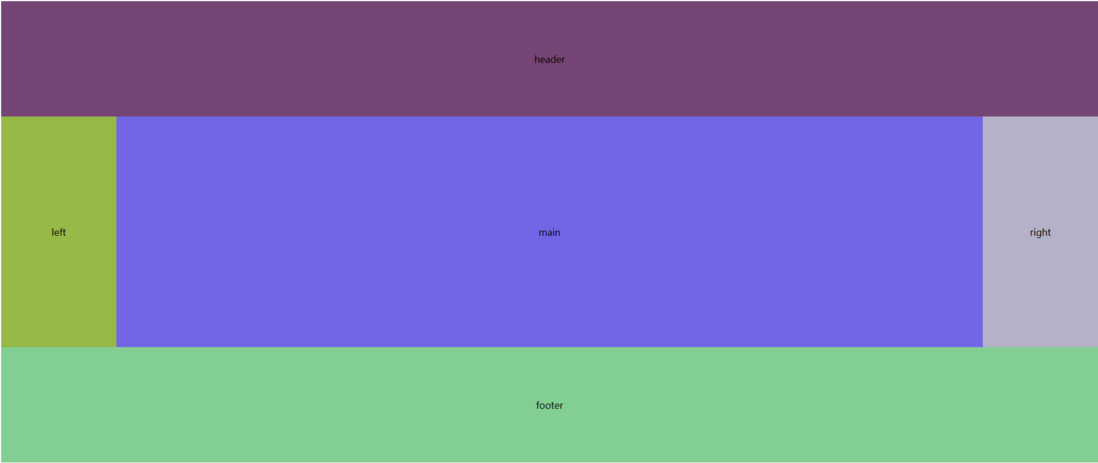
缩放效果图如下
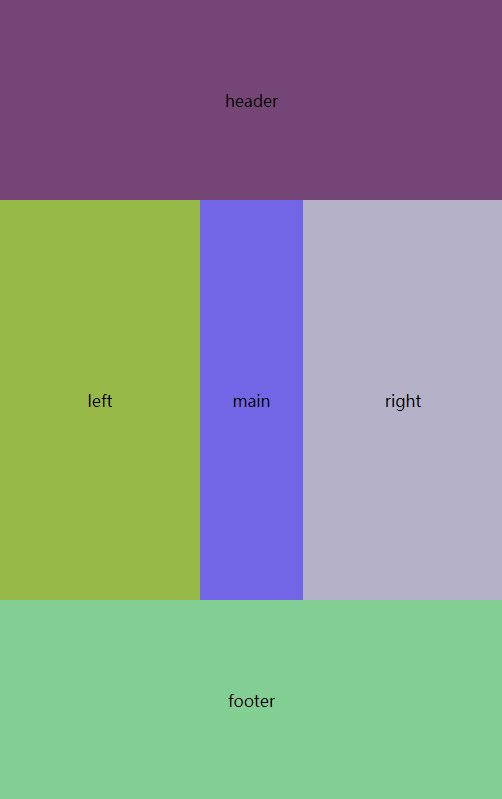
优点:解决了圣杯布局带来的缺陷,支持各种宽高变化,通用性强缺点:多加一层DOM结构,导致页面渲染性能下降,加渲染树生成的计算量。
评论
登录后参与技术讨论,分享你的经验与见解。
登录 / 注册暂无评论