GRID学习

文章目录
简介
Flex 布局是轴线布局,可以说是一维布局。Grid 布局则是将容器划分成"行"和"列",产生单元格,然后指定每一页单元格,可以看作是二维布局。Flex布局和Grid布局不冲突,它们的使用场景是不一样的。
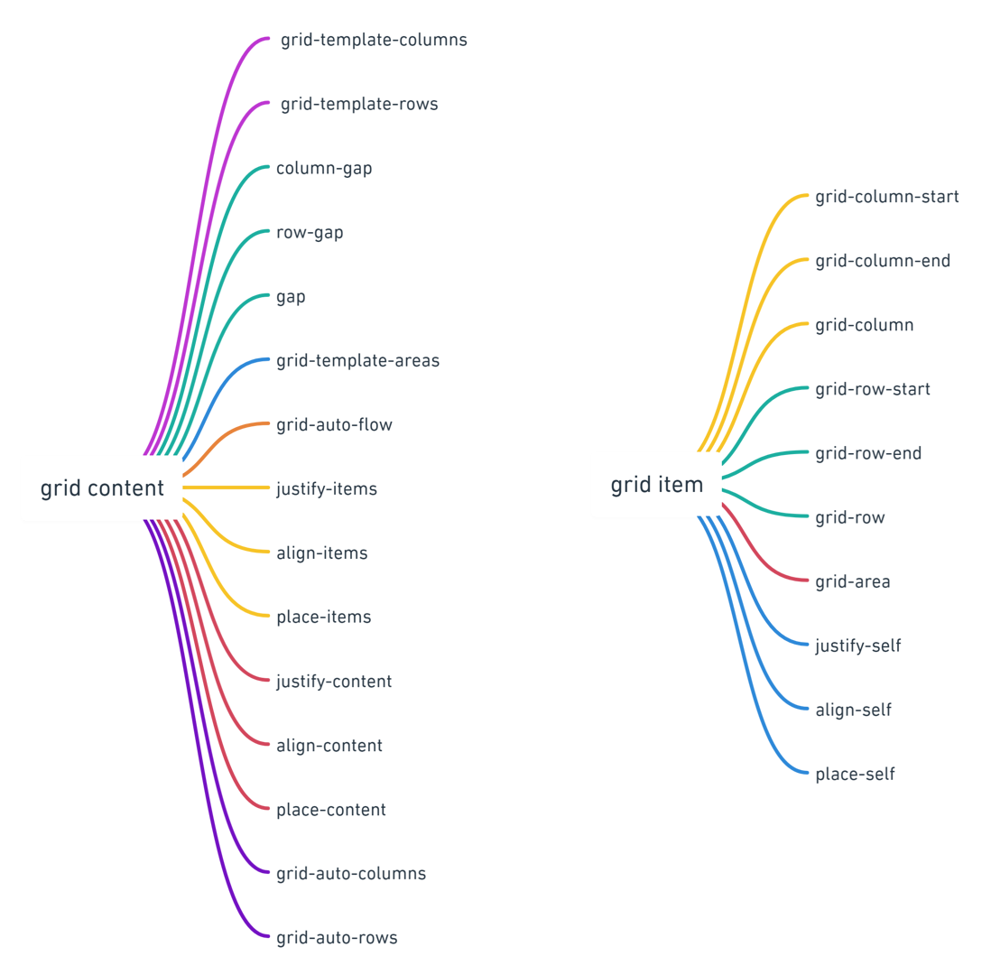
概念
容器和项目
采用网格布局的区域,称为"容器"(container)。容器内部采用网格定位的子元素,称为"项目"(item)。例如:
<div class="container">
    <div class="item"><span>1</span></div>
    <div class="item"><span>2</span></div>
    <div class="item"><span>3</span></div>
</div>上述代码中,container就是容器,item就是项目,而span不属于项目(除非span也设为grid,那么span就是item的项目)。
行和列
容器里面的水平区域称为行(row),。垂直区域称为列(column)。
单元格
行与列相交的区域为cell单元格
网格线
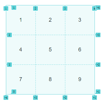
划分网格的线,称为"网格线"(grid line)。水平网格线划分出行,垂直网格线划分出列。
正常情况下,n行有n + 1根水平网格线,m列有m + 1根垂直网格线,比如三行就有四根水平网格线。
如果用Chrome浏览器打开调试面板,在结构里可以看到一个grid的标记,点击会显示网格线,并标有相应的序号,如下图所示:
容器属性
display 属性
gird为块级元素,inline-grid为行内元素。
grid-template-columns 和 grid-template-rows
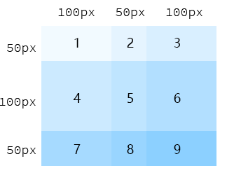
grid-template-columns属性定义每一列的列宽grid-template-rows属性定义每一行的行高。
如图所示:
.container{
   grid-template-columns: 100px 50px 100px;
   grid-template-rows: 50px 100px 50px;
}
除了使用绝对单位,也可以使用百分比。
.container{
   grid-template-columns: 20% 30% 50%;
   grid-template-rows: 20% 30% 50%;
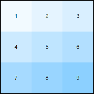
}repeat()repeat()接受两个参数,第一个参数是重复的次数,第二个参数是所要重复的值。例如:
.container {
  display: grid;
  grid-template-columns: repeat(3, 100px);
  grid-template-rows: repeat(3, 100px);
}
也可以重复一组数值:
grid-template-columns: repeat(2, 30px 50px 80px);auto-fill
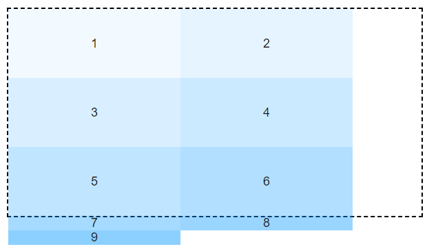
有的时候,单元格的大小是固定的,但是容器的大小不确定。如果希望每一行(或每一列)容纳尽可能多的单元格,这时可以使用auto-fill关键字表示自动填充。
如果是列不足位置填充,则换行显示,直到超出容器,列宽会一直是定义的宽度。
如果是行高填充的值大于容器高度,则剩余的内容将会超出容器,不足的位置的元素高度会失效。
.container {
  margin: 20px;
  width: 600px;
  height: 300px;
  display: grid;
  grid-template-columns: repeat(auto-fill, 250px);
  grid-template-rows: repeat(auto-fill, 100px);

}
fr 关键字
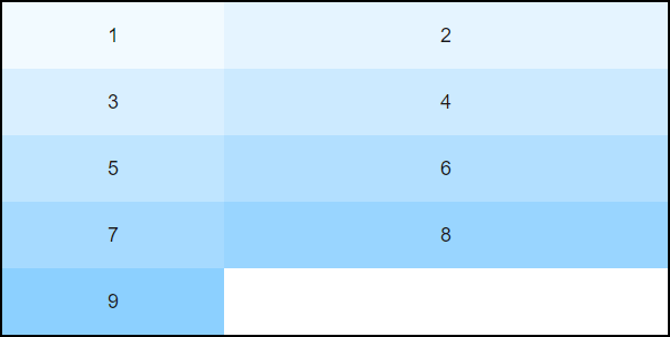
为了方便表示比例关系,网格布局提供了 fr 关键字(fraction 的缩写,意为"片段")。如果两列的宽度分别为 1fr 和 2fr,就表示后者是前者的两倍。
.container {
  display: grid;
  grid-template-columns: 1fr 2fr;
}
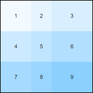
fr 还可以与绝对长度的单位结合使用。
.container {
  display: grid;
  grid-template-columns: 100px 1fr 2fr;
}
minmax()minmax()函数产生一个长度范围,表示长度就在这个范围之中。它接受两个参数,分别为最小值和最大值。
.container {
  display: grid;
  grid-template-columns: 1fr 1fr minmax(150px, 1fr);
}
如图所示,当1fr大于150px时,显示为容器的1/3。小于150px时,则宽度固定为150px。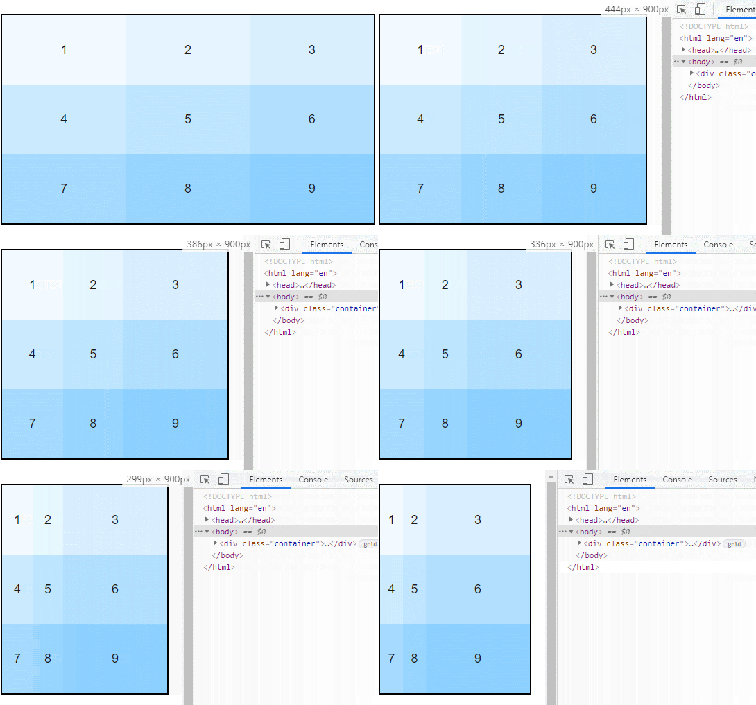
网格线的名称
网络线有默认的编号,也可以指定网格线的名字,用方括号包起来,方便引用。如:
.container {
  display: grid;
  grid-template-columns: [c1] 100px [c2] 100px [c3] auto [c4];
  grid-template-rows: [r1] 100px [r2] 100px [r3] auto [r4];
}网格布局允许同一根线有多个名字,比如[line-5 row-5]。
gap间距
row-gap属性设置行与行的间隔(行间距),column-gap属性设置列与列的间隔(列间距)。
也可以简写为:
gap: 10px 20px;等同于:
row-gap: 10px;
column-gap: 20px;
只写一个值时表示行列的间距相同。
grid-template-areas & grid-area
网格布局允许指定"区域"(area),一个区域由单个或多个单元格组成。grid-template-areas属性用于定义区域。
而grid-area属性则指定项目放在哪一个区域。
这两个属性需要配套使用,可以将网页本身的布局千变万化。
.container {
  display: grid;
  grid-template-columns: 100px 100px 100px;
  grid-template-rows: 100px 100px 100px;
  grid-template-areas: 'a b c'
                       'd e f'
                       'g h i';
}
多个单元格合并成一个区域的写法如下。
grid-template-areas: 'a a a'
                     'b b b'
                     'c c c';
区域命名可以改变元素的位置,可以打乱本身的顺序,例如:
.container {
  margin: 20px;
  display: grid;
  grid-template-columns: repeat(4, 1fr);
  grid-template-rows: repeat(5, 100px);
  grid-template-areas: 'a a a a'
                     'b b c c'
                     'd d d e'
                     'f g g g'
                     'h h i i';
  border: solid 2px #000;
}
.item:nth-child(1){
  grid-area: a;
}
.item:nth-child(2){
  grid-area: b;
}
.item:nth-child(3){
  grid-area: c;
}
.item:nth-child(4){
  grid-area: d;
}
.item:nth-child(5){
  grid-area: h;
}
.item:nth-child(8){
  grid-area: i;
}
.item:nth-child(7){
  grid-area: g;
}
.item:nth-child(9){
  grid-area: e;
}
显示效果如下:

对齐方式
- justify-content
- align-content
place-content
justify-content属性是整个内容区域在容器里面的水平位置(左中右),align-content属性是整个内容区域的垂直位置(上中下)。place-content属性是align-content属性和justify-content属性的合并简写形式。- justify-items
- align-items
- place-items
justify-items属性设置单元格内容的水平位置(左中右),align-items属性设置单元格内容的垂直位置(上中下)。 - justify-self
- align-self
- place-self
justify-self属性设置单元格内容的水平位置(左中右),跟justify-items属性的用法完全一致,但只作用于单个项目。
评论
登录后参与技术讨论,分享你的经验与见解。
登录 / 注册暂无评论